We make ourselves understood. We let ourselves be loved.
In each letter of our name you will find the beginning of a beautiful story.
🤝 “U” for union. Because together, everything is better.
💶 “C” is for Credits. What we do, who we are.
🏠 “I” for Real Estate. Because we always talk about homes, about buildings.
And even though you read “u,” “ce,” and “i,” we’re called “UCI.” All together.
Welcome to the home of our resources
We are simple, period.
Three letters, three words, and many virtues. The most important thing is that we are easily recognized.

We have colors, and feelings
When you're happy you see everything through rose-colored glasses, and when you have to buy a house, through red.

Knowledge also has color
If there's one thing that sets us apart, it's that we anticipate everything that might happen. To achieve this, it's important to know. And that's why the color of wisdom is our secondary color.

A color to lean on
Walking together, having a consultant at each client's side, and a color that will always support you.


We like to speak clearly
Raise your hand if you're tired of not understanding what we're being told; and raise your hand if you're tired of reading small print. Here, everything is clear and in Jornada Sans.

Lorem ipsum dolor sit amet, consectetur adipiscing elit
Lorem ipsum dolor sit amet, consectetur adipiscing elit. Nulla vehicula luctus neque, nec posuere justo fermentum a.
Lorem ipsum dolor sit amet, consectetur adipiscing elit
Lorem ipsum dolor sit amet, consectetur adipiscing elit. Nulla vehicula luctus neque, nec posuere justo fermentum a.
Lorem ipsum dolor sit amet, consectetur adipiscing elit
Lorem ipsum dolor sit amet, consectetur adipiscing elit. Nulla vehicula luctus neque, nec posuere justo fermentum a.

Brand promise
We promise what's part of us, everything we can give. We promise that you don't need to change banks; that you can go beyond the standard to finance your home.
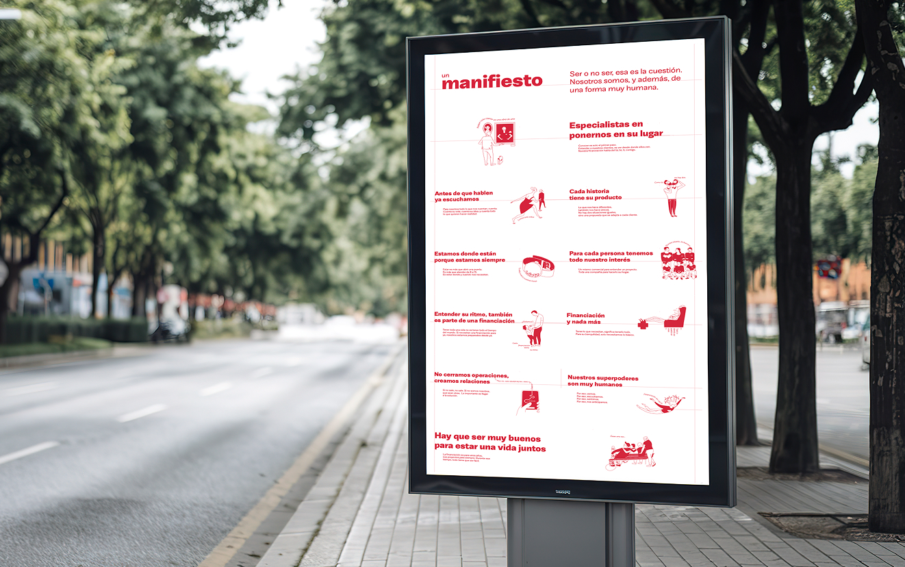
To be is the most important thing
Be about financing homes, about understanding people; be about going faster, or slower. Be about deciding what you want to be. Be about you, and be about your customers.